One of my most influential teachers in high school had a phrase that stretched across the wall of his classroom. Written in perfect script, it read: The message is in the receiver. Any time one of us teenagers contested a grade or insisted to him, “But that isn’t what I meant!” he would stroll over to his wall and, with a sly smile, remind us of that rule. (We probably even had to recite it in unison a few times at the beginning of the year.) We loved to hate it, primarily because it established that we weren’t the sole definers of our conversation with the world. So many years after grappling with that principle as a high school student, those six little words have stuck with me. They’ve floated to the surface continually as I’ve grappled with Brenda Dervin’s treatise on sensemaking theory. The message is in the receiver. This is the core of how I understand sensemaking theory.
In From the Mind’s Eye of the User, Dervin explains that the way we process information “needs to be studied from the perspective of the actor.” (p. 64) As a teacher, if I am to take that to heart, it means that the way my students receive information takes precedence over the way I want to dole it out. By default, I know that I am wordy and detail-oriented. And I like pictures. Getting every nuance of argumentative writing into my students’ minds, fattened up with lots of beautiful language, embellished by memorable images, all at once, might make me feel like I’m doing a good job. But if it leaves my students asking, “Huh?” I haven’t gotten it right. Dr. Bobbe Baggio, in The Visual Connection, makes the research on how people receive information indisputably clear: “Less is more.” (p. 121) This simple wisdom, combined with the importance of the receiver (or actor, or student), has been deeply grounding in how I shape my lessons, as well as how I plan my capstone.
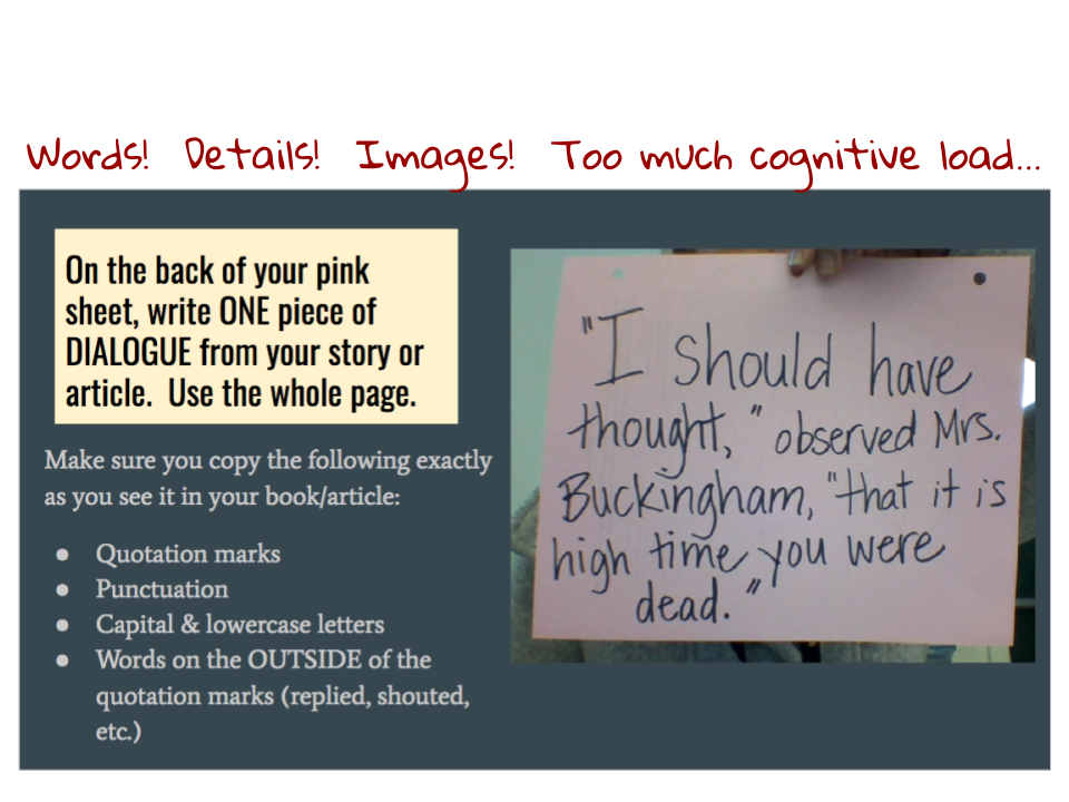
I mentioned earlier that I like pictures. According to Baggio, I’m not alone- 85% of us are visual learners (The Visual Connection, pg. 49). That doesn’t just mean photographs and drawings- Baggio explains in her book that we take in slides as one image. That includes words, white space, and the “chunking” of information (p. 98, 126). Gaining a better understanding of how this works has made me entirely more confident about how I make slides and graphic organizers for my class. Reducing the cognitive load and presenting simple visuals started as a way to reduce my own frustration with my students who have learning differences, but has evolved into a simple standard for best practices. I especially appreciated the latter chapters of Baggio’s book, which gave specific examples and non-examples for visual design. I love this stuff! I intend to keep Baggio’s principles in mind as I design my capstone, along with the idea that the message is with the receiver.
In From the Mind’s Eye of the User, Dervin explains that the way we process information “needs to be studied from the perspective of the actor.” (p. 64) As a teacher, if I am to take that to heart, it means that the way my students receive information takes precedence over the way I want to dole it out. By default, I know that I am wordy and detail-oriented. And I like pictures. Getting every nuance of argumentative writing into my students’ minds, fattened up with lots of beautiful language, embellished by memorable images, all at once, might make me feel like I’m doing a good job. But if it leaves my students asking, “Huh?” I haven’t gotten it right. Dr. Bobbe Baggio, in The Visual Connection, makes the research on how people receive information indisputably clear: “Less is more.” (p. 121) This simple wisdom, combined with the importance of the receiver (or actor, or student), has been deeply grounding in how I shape my lessons, as well as how I plan my capstone.
I mentioned earlier that I like pictures. According to Baggio, I’m not alone- 85% of us are visual learners (The Visual Connection, pg. 49). That doesn’t just mean photographs and drawings- Baggio explains in her book that we take in slides as one image. That includes words, white space, and the “chunking” of information (p. 98, 126). Gaining a better understanding of how this works has made me entirely more confident about how I make slides and graphic organizers for my class. Reducing the cognitive load and presenting simple visuals started as a way to reduce my own frustration with my students who have learning differences, but has evolved into a simple standard for best practices. I especially appreciated the latter chapters of Baggio’s book, which gave specific examples and non-examples for visual design. I love this stuff! I intend to keep Baggio’s principles in mind as I design my capstone, along with the idea that the message is with the receiver.
 RSS Feed
