Form and Color
Always design like Apple. Unless you can design like Stanley Mouse- then you should design like Stanley Mouse.
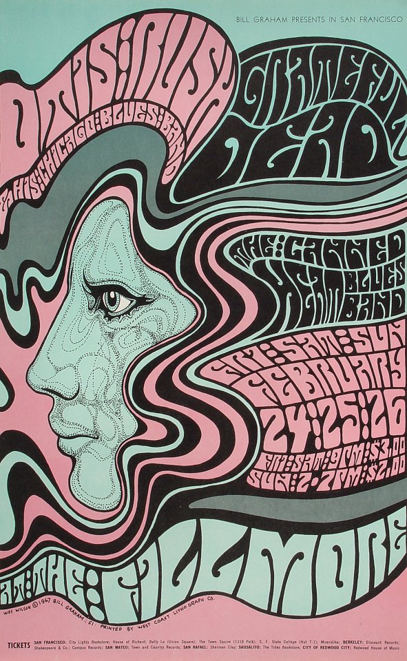
I recently saw a documentary that discussed how groundbreaking (and rule-breaking) Grateful Dead posters were in the '60s. Artist Stanley Mouse often created them under the influence of psychedelics, and the unusual posters"invited the viewer to interact" in order to understand them. In other words, they were bold enough to get your attention, but in order to read the text, one really had to get up close. They required work.
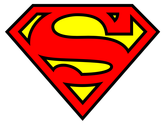
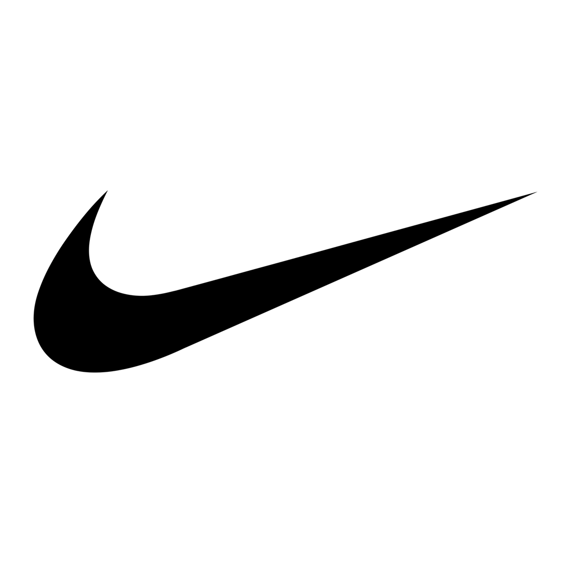
Unlike Grateful Dead posters, most popular logos require minimal work. Two- to- four colors, a few basic shapes, bold lines. Nike. Apple. Superman. They work because you don't have to. I'll keep this in mind as I develop a logo for my capstone. I'll do my best to create something that invites the viewer in, but doesn't require quite the amount of work that Stanley Mouse demanded of his audience.
I recently saw a documentary that discussed how groundbreaking (and rule-breaking) Grateful Dead posters were in the '60s. Artist Stanley Mouse often created them under the influence of psychedelics, and the unusual posters"invited the viewer to interact" in order to understand them. In other words, they were bold enough to get your attention, but in order to read the text, one really had to get up close. They required work.
Unlike Grateful Dead posters, most popular logos require minimal work. Two- to- four colors, a few basic shapes, bold lines. Nike. Apple. Superman. They work because you don't have to. I'll keep this in mind as I develop a logo for my capstone. I'll do my best to create something that invites the viewer in, but doesn't require quite the amount of work that Stanley Mouse demanded of his audience.
|

|
|
|
